Useful, but flawed
1. Starts up in portrait. Painful if using it on an iPad. Works fine in landscape once you pass the login screens
2. Why the need for the second screen telling you when you last logged in? A new ‘feature’ added, now takes an extra key press. Add the login date on the main screen
3. On messages, the notifications serve absolutely no purpose. I get a notification to say I have a mail, but then the messages icon has a blue dot indicating I have messages. Get rid of the notifications (at least for new messages) - it just wastes my time
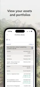
4. On setup, you can ask to view the detailed list of instruments instead of pie charts - this does not work.
5. No export - really would be better if the content could be exported to a spreadsheet.
6. The layout could include an option to show instrument, qty, price, change - so that you can see a lot of results on one screen. To look through the portfolios, you need to enter into each instrument, have a look and then back out. Not very efficient if you just want to know how the portfolio is doing.
7. Saving messages as pdfs


