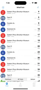
Effective and simple
And there’s a tab for you to see if there are train delays or changes - saves time from clicking into the MTA website. It is a little hard to see the message sometimes when it’s super long because all the sentences flow together without any sectioning to separate out the stops that are affected.
And I’m really happy about the addition of the maps. Now I don’t have to use NextStop (my other train app) to check for alternatives.
Response from developer
Thanks for the feedback! I definitely agree with you about the long train statuses. That’s next on my list of things to try to improve. The MTA distributes those statuses in a fairly developer-unfriendly way, but other apps parse them to be more readable than my app does. So, it’s doable; I just need to spend the time to do it. Thanks, again!


