Not great
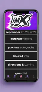
This ap feels like someone just took the website and threw it onto mobile without considering the differences. It’s hard to find what I need on a small screen. I wish I could “zoom out” because I want to see the bigger picture. When one celebrity takes up the whole screen it’s a pain to scroll through them all and when the schedule has large blanks of time or cuts off text unless you scroll, it can be real tedious to see when things are happening and where. There’s no easy way to browse! It seems you have to know specifically what to look for. But even when I search “Harry Potter” it will up the panel, but it does *not* bring up the related celebrities there, the photo ops available, or autographs opportunities. Also, some of it is a little counterintuitive. If you want an autograph, do not go to the autograph page, go to the specific celebrity, because the autograph page doesn’t have a search and there are a *lot* of celebrities to scroll through.


