Latest Update made a Good app Meh
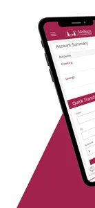
1. It requires more taps to see full account information. Before, you just needed to select the account you wanted to view and all transactions for the month would appear. Now, you have to tap accounts->select account->open up the recent transactions box. You then have to click on “view all” to get a better view of the account.
2. The recent transactions box is much smaller and harder to scroll through and view (smaller text!). The old layout just utilized the full screen which was easier to view.
3. The recent transaction box uses parenthesis and red text to indicate a withdrawal. This doesn’t make much sense initially. The “view all” button shows deposits and withdrawals better, but it is hidden away at the bottom of the recent transactions box.
4. Navigation is much more difficult in certain parts of the app. For example, the messages section has two options. If you accidentally click one, there is no back button to view the other option you meant to click. You instead have to click the drop down menu and click messages.
The one positive of the new layout is that it is much more modern looking. I just think the above issues need to be addressed before this app can be considered good again.


