Perfect. Minimalism yet Playful
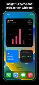
Please I need the Circular graphic for the Spend Profile on the Summary page be put back. I recently noticed it has been changed to a Bar Chart for each Bucket Category. May be let users have the option of choosing which they want.
Response from developer
Hello 👋 Thank you for the delightful review. Glad to hear that you are enjoying the app’s simple yet flexible approach to tracking finances. Hoping to put together some exciting new features soon! If you end up having any suggestions, you can always reach out to me on here or via the app.


